


Brand + UI
Nourish's product infrastructure had grown immeasurably since its inception. There was now a multitude of user features and functionality, as well as an increasingly discerning customer base. The user interface had evolved to keep pace with the ever-changing demands of a start-up, and had matured into a highly recognisable design within the sector. In fact, many clients conceded the ‘friendly’ interface had influenced their choice of provider – always nice to hear!
Design and development had until now, largely managed changes and updates 'on the fly’ through good communication – all part of being a lean start-up with remote teams – but it wasn’t ideal going forward. There was now a strong business case for a well documented design system that the whole product team could access and keep up to date with.
As an early-stage hire, I’d overseen and delivered the product interface, from a blank canvas to the present iteration. It had now developed into a series of adaptable and editable modular components, which helped to create a familiar feel for each user journey, when combined with insightful UX design.
Sketch had been used to create our UI designs, so it made sense to establish a central repository where all the original artwork would reside, and could be referenced from (yes I know this isn’t a true Design System, but we were a tiny team with little budget or resources).
Liasing closely with our front-end developer, and following the main Atomic Design principles, I categorised each and every component – reducing down when I found repetition or redundancy, and refining when I saw inconsistency. By utilising Sketch’s nested symbols, I refactored each layer of the interface, using previously created ‘symbols' to build up more complex components – each meticulously labelled for other designers to reference and navigate. Zeplin was used as the handoff tool to the development team, meaning updates could easily be pushed through using the native Sketch plug-in. It was an ideal low-effort solution that suited our needs as a small product team.
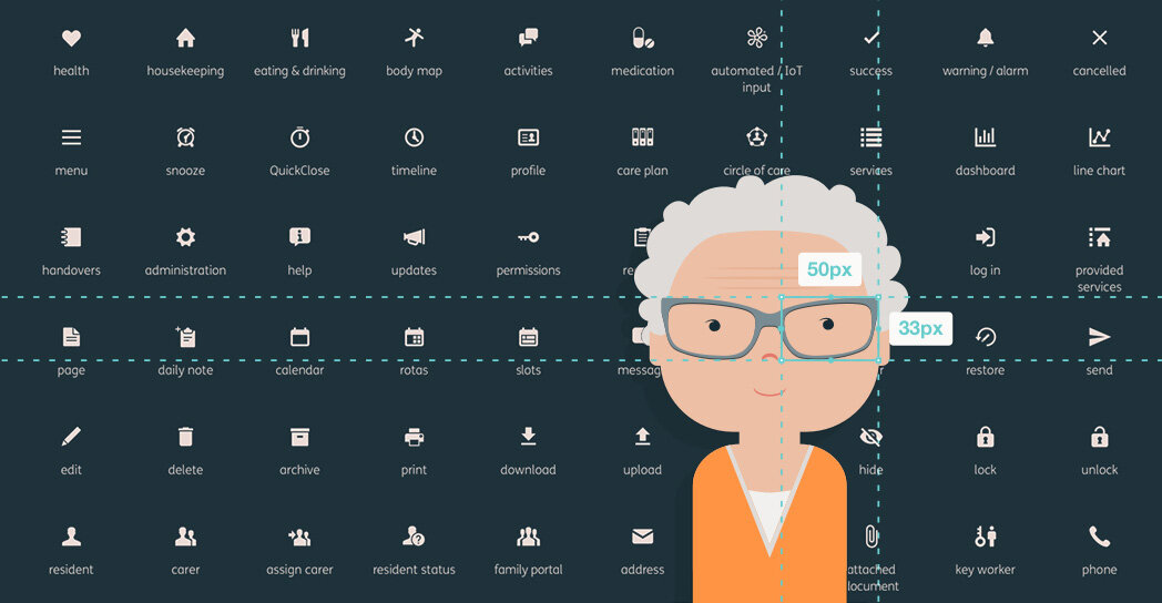
A small selection of icons…
All icons followed Google’s Material Design specifications – 24dp artboard with a 20dp ‘live area’ – and were drawn pixel perfect at 100% size for maximum accuracy and resolution. Consistency of corner radius’, line weights and style ensured a cohesive set of icons throughout the product.
Zeplin’s simple interface meant the development team could easily access CSS information for every single component, as well as download .svg and .png files.
The Nourish user interface had to work across many different screen builds and sizes.
As it stands, the Nourish Design System is currently a Beta project. Ideally it would progress to a fully functioning online Pattern Library, but with internal resource at a premium, and the current solution serving the small team well enough, it’s not a top priority… for now.
However, there is now a central resource for all design components, internal processes for updating and alerting the team to additions and changes, and it’s accessible online for an internal audience. Which is a much better place than we were before.