


Product + UI + UX
Nourish was appointed by Bournemouth University (BU) to design and build a medical-grade breathing app aimed at reducing high blood pressure. Using a patent-pending algorithm, and an external heart rate sensor, users would follow a personalised slow breathing exercise for ten minutes a day.
Deliver a product for use in clinical trials (iOS & Android), that could also become commercial at some future date. The main considerations were;
• Create an animation to guide users in paced-breathing
• Convey trust through user experience design
• Encourage completion of daily sessions
• Design within a strict budget and time allocation.
BU identified pregnant women as the first target for their clinical trials, and had already begun to contact local antenatal groups. Further down the line though, Brythm was intended to be used by anyone suffering with hypertension.
My role
I undertook the user centred design and user interface design on this project, as well as the brand identity and naming strategy – an opportunity that doesn’t come along very often! I worked with Project Manager José Reis from Nourish, and the technical team at Deemaze, and also liased directly with Brythm creators, Professor Alison McConnell from BU, and Simon Wegerif from ithlete (who designed the algorithm and sensor).
I tested several breathing and meditative apps to get a sense of what they felt like to use. Calm (above right) was the easiest to follow, giving an accurate indication of timing within the breathing cycle. Many displayed similar solutions in illustrating breathe cycles; namely expanding and contracting circles. Most did not give a clear indication of when to stop breathing in or out, making them challenging to follow accurately. Some were far from relaxing, using stern voice instructions and lurid colours. I shared my findings with the team and client and began defining the first prototype designs for the main animation screens.
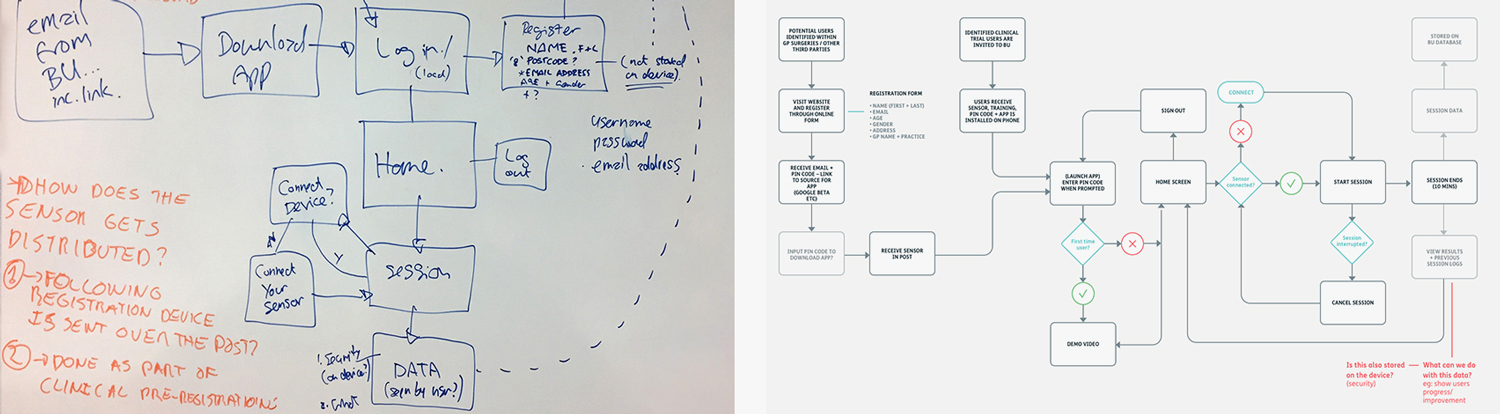
I created a full user journey as I already had the basic requirements, and wanted to quickly see how they would be ordered and interact with one another. From this I planned out a complete system specification, which proved useful in clarifying the product screens to the client prior to the initial build.
I was also under time pressure to allow the dev team to start work as soon as possible, so getting the system architecture decided now enabled us to start working in parallel, allowing for a shorter timetable to the first prototype build, and first user testing.
Early product flow design showing login to session completion.
During my research phase, I read a study paper which compared how two distinct moving shapes, under test conditions, influenced users' breathing rhythms. They looked at an expanding/contracting circle and a triangular waveform, focusing on two aspects; the accuracy of the data being recorded, and the user’s preference.
The results were users preferred the expanding/contracting circle. However the waveform returned slightly more accurate data results.
We also had a third option; a novel arc-shaped wave designed and animated by BU animation student Joshua Mwanakhu, which the present beta version of Brythm used. It felt like a more natural movement, echoing a human diaphragm. But, as this was a medical-grade app built on academic research, I wanted to represent it faithfully by approaching the whole design from a ‘scientifically sound’ basis.
I hacked these rough animation options together in Adobe After Effects. It enabled me to see how they might look in practice, and also to demonstrate them to the team. After some discussions with the client, it was decided to trial all three options at our first user test.
Low fidelity in-app animations (below) were then created by Deemaze, following my designs, so the client could undertake laboratory tests to establish the relative accuracy of each methods, and user preferences.
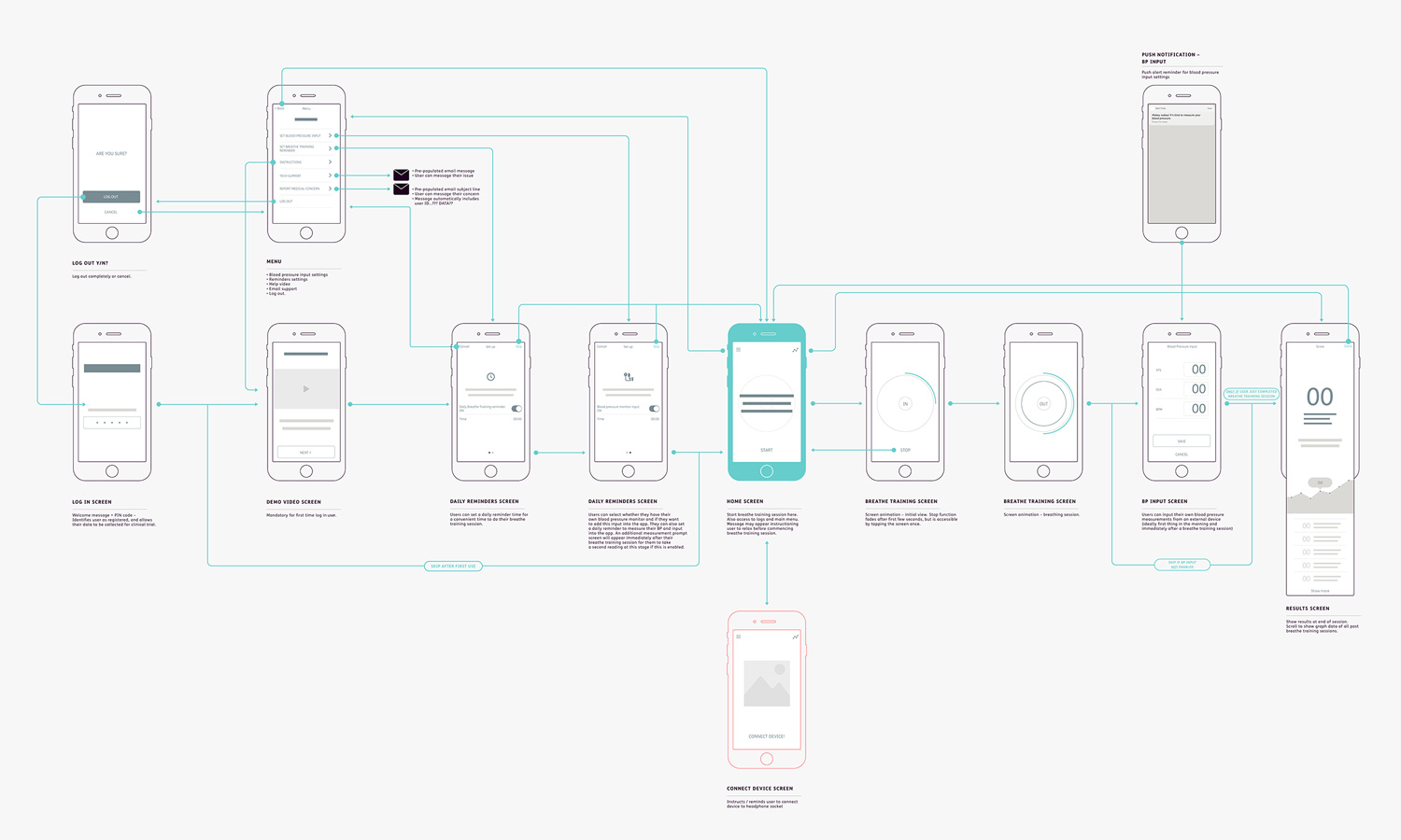
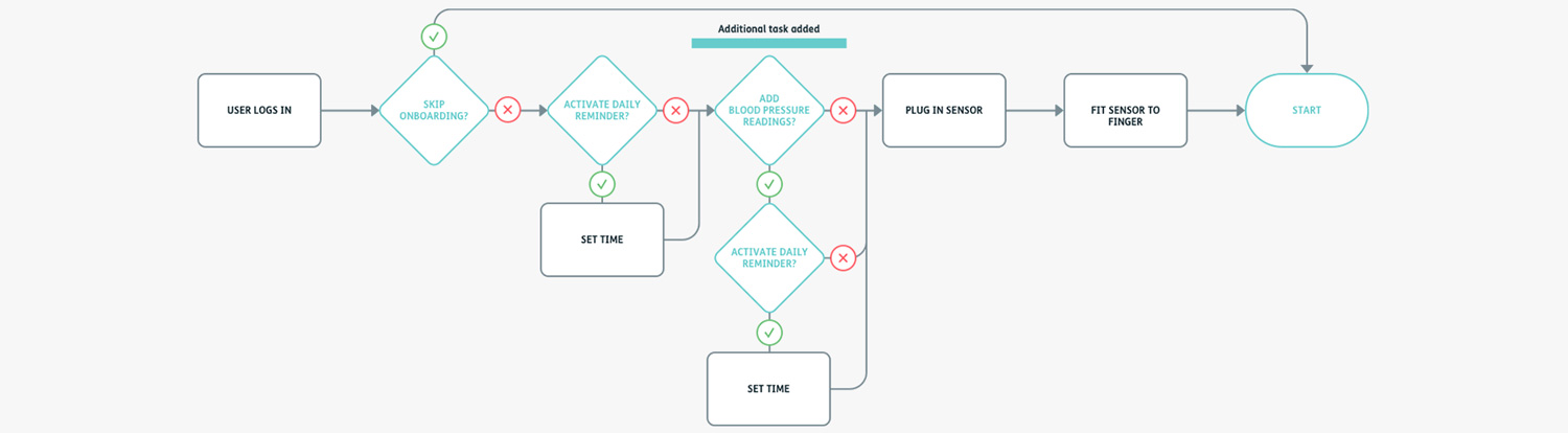
As well as instructing how to correctly connect the sensor, users were also encouraged to set daily reminders for their breathing exercises. Blood pressure readings, ideally taken when the user woke up, were added on the client's request, which in turn required their own daily reminder. The need to capture the best clinical data for future research was the driving force here, so an easy user onboarding process was crucial.
Above: Revised task flow with additional blood pressure input and reminder alarm.
Below: A single screen solution for easier user set-up.
Volunteers from two antenatal groups tested our first prototype. Due to budgetary restraints, research students from BU conducted the test sessions, along with a user test script and guide written by myself. Each user was filmed so we could better analyse the test results.
Key insights
• Onboarding straightforward, but skipped by some users
• Daily reminder alarms set easily
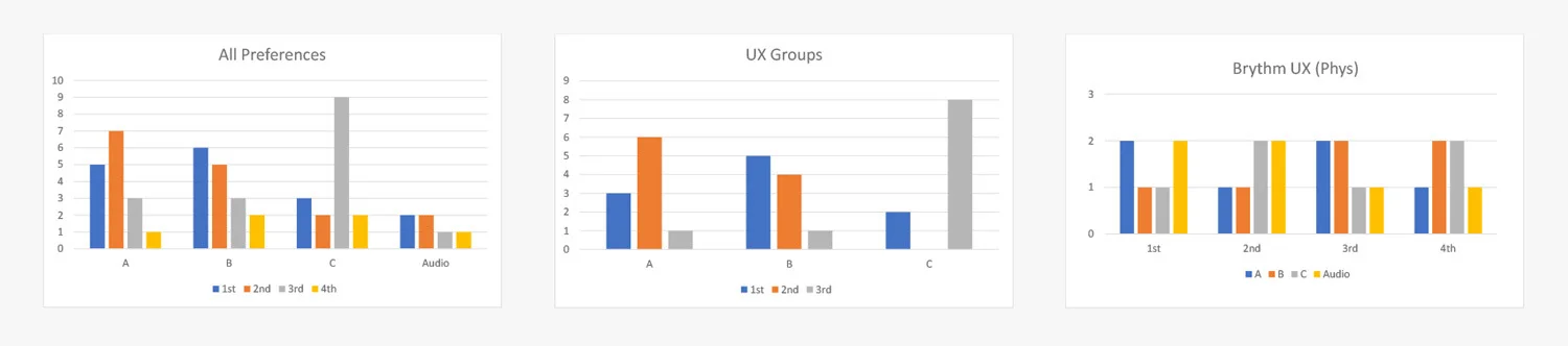
• Animation UI was “basic” (it was!)
• The sine wave (C) was not liked.
Users favoured option B (arc), with option A (circles) a close second. Desite our assumptions that it might be the easiest one to follow, option C (sine wave) was a distant third.
As well as being the users' favourite – some felt it more closely followed a human diaphragm relaxing and contracting – option B was also unique from a commercial perspective. But while it was great to be unique, I now had the challenge of designing a UI with a slightly awkward shape at its heart, instead of the geometric simplicity and minimalism of a circle.
"Trust is an important factor in health applications because it is about people’s health and the users need to be comfortable that the application can help them.” (Eysenbach & Kohler, 2002)
As this was a medical-grade app, founded on academic research, I wanted to represent it faithfully by approaching the whole design from a ‘scientifically sound’ basis. I found a master thesis by Brita Havik studying the effect of visual aesthetics on the perceived usability and trust of a digital product. In short, the study concluded that trusted user interfaces had both a high colour contrast and low visual complexity.
This was especially desirable for health-related environments, where users sought for more reassurance. The next step was to design a clean, elegant and simple UI where I could bring all my learnings together.
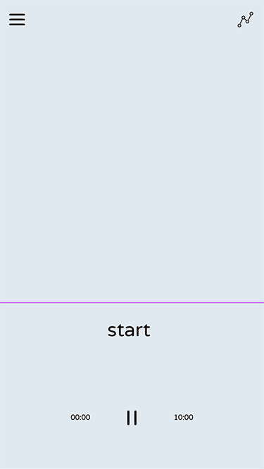
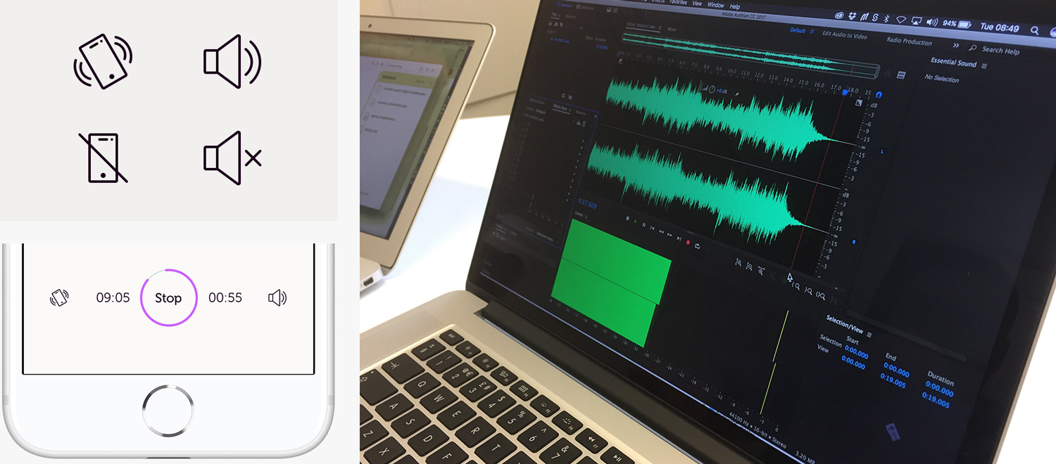
As the development team were in Portugal, and I was in the UK, describing exactly how I saw the animation working was not a straightforward conversation. I created a quick GIF to demonstrate what I had in mind for refining the main arc shape. I also designed the main UI controls to fade away after a few seconds, focusing the user on the timed-breathing animation, with a single screen tap to bring them back up.
The dev team were concerned about the complexity of animating a gradient. I proposed using a masked curve overlaid onto a gradient background, which vastly reduced the coding complexity and time.
We wanted to validate the changes from the first user test, and also test the final onboarding experience (beyond the colleagues, friends and family I pestered). I visited an antenatal group with BU PhD students to gather more feedback from individual attendees.
Image has been blurred to respect individuals privacy.
Key insights
• Overall easy and straightforward to use
• Colour palette and animation liked
• Missed having sound to accompany the animation
• Not clear what the score format meant.
Sound libraries did not prove very useful here. A chance conversation with a musically-trained colleague led to us creating our own sound using basic software for the main key, and Adobe Audition to layer effects. I was aiming for a soft, synthesised and relaxing sound – but crucially one that had the right ‘shape’ so users could identify where they were in each breath cycle.
Press play below and try to breathe in time with just the sound.
Unfortunately, after some deep technical research from Deemaze, we were not able to implement the intended sound due to complex manufacturer hardware and software blockers. In short, the sensor re-routed the phone’s sound output through the headphone socket, and this was already simultaneously recording and transmitting data. In the end, we all had to admit defeat (for now) and implement a simple beep.
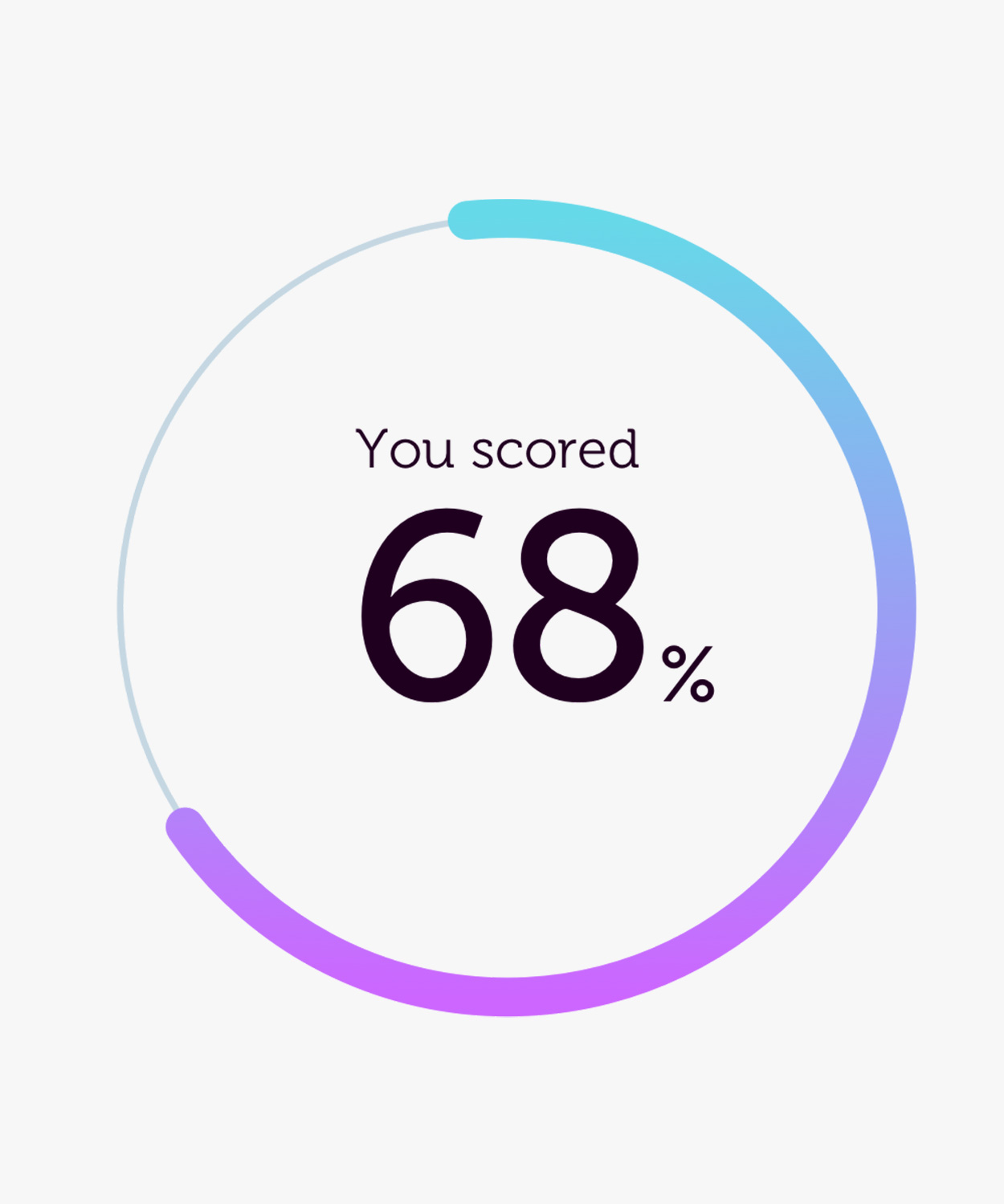
The decision was made not to use blood pressure readings at the end of each breathe training session as a means of scoring – besides if users were taking their own readings they would already know this. We had to indicate progression to users in another way. So the client produced a percentage-based unique Brythm Score, based on the scientific data generated within the app.
QA testing was conducted throughout the project.
I was really pleased with the outcome of the whole project. It was a genuine privilege to be leading all aspects of the design, from the naming, UX research and prototyping, to the final UI and product branding.
I learnt a huge amount during this project…
• User observations are invaluable, even when done via video
• Dividing work by task-type made the project more manageable
• I can design an end-to-end product solution
• Talented devs are worth their weight in gold!
At the time of writing, Brythm is about to start clinical trials. Aside from the primary task of gathering medical data, I will be very interested to hear the feedback from users regarding their experience of the app, the animation, and whether it became part of their daily routine.