


Product + UI + UX
Care providers are obligated to keep skin condition records of the people in their care. This can be anything from cuts, bruising and bed sores, to wounds and long-term conditions. Certain information is required, including the location, date, size and actions taken, to name but a few. Nourish already had a ‘body map’ on its web portal designed for such record keeping.
What are we trying to solve?
Not all care staff working ‘the floor’ of a care or nursing home have computer access – instead they use mobile handsets and record on-the-go. Managers would like nurses and carers to be empowered to create digital notes at the point of care. This would remove the burden on office based staff, as well as allow more up-to-date care and accurate records – nurses would no longer need to recall details later from memory.
The challenge
• Provide a mobile-optimised tool
• Make it easy for non-clinical staff to use
• Make it comprehensive enough for nurses
• Give access to all archived records.
As well as these user-centric requirements, I also had to fulfil certain business requirements. Namely deliver a quick solution to customers that required no back-end dev changes to the system architecture.
I led on all design aspects of this project. Working with existing customer feedback, I attended site visits and user interviews, created user task flows and built prototypes. I then refined the UI design through usability testing and colleague feedback, finally producing design handoff output for the software team.
I worked within a team of project stakeholders, including the Product Manager, Android and web developers, as well as a clinical nursing consultant and current customers.
We regularly collated customer comments from all our feedback channels. So we already had a good steer of their views and emerging patterns with regards to what they wanted and valued. We also undertook field visits to customers (specifically nursing homes) to validate our assumptions so far, as well as consult with an external clinical consultant to ensure we delivered a best practice solution.
User goals collated from multiple sources / mapping and optimising new task flows.
Drawing up user flows was an inexpensive way of testing out several options. I had some ideas on how to improve the user experience without the need for any back-end dev changes – and further improvements we could add in if they proved they were worth building.
I worked up the user goals and task flows into a number of sketched interface designs – carefully considering how they would integrate within the existing product architecture and retain a familiar interface for our customers.
I needed to validate assumptions with users quickly. I created a rough clickable prototype from my sketches using Marvel so I could observe how they would interact with it.
A touchable body map users would interact with directly
It threw up some results immediately which I categorised into quick wins needing little effort, and those which required more investigation or changes to the proposed architecture.
Throughout the design process of user journeys and the interface, I consulted and tested with users, both in person and remotely. I’d built up many good relationships with our customer base, so it was easy for me to quickly test something via a video chat, or even fire a quick question over email. My Nourish colleagues were also invaluable, as many had worked directly within the care sector before.
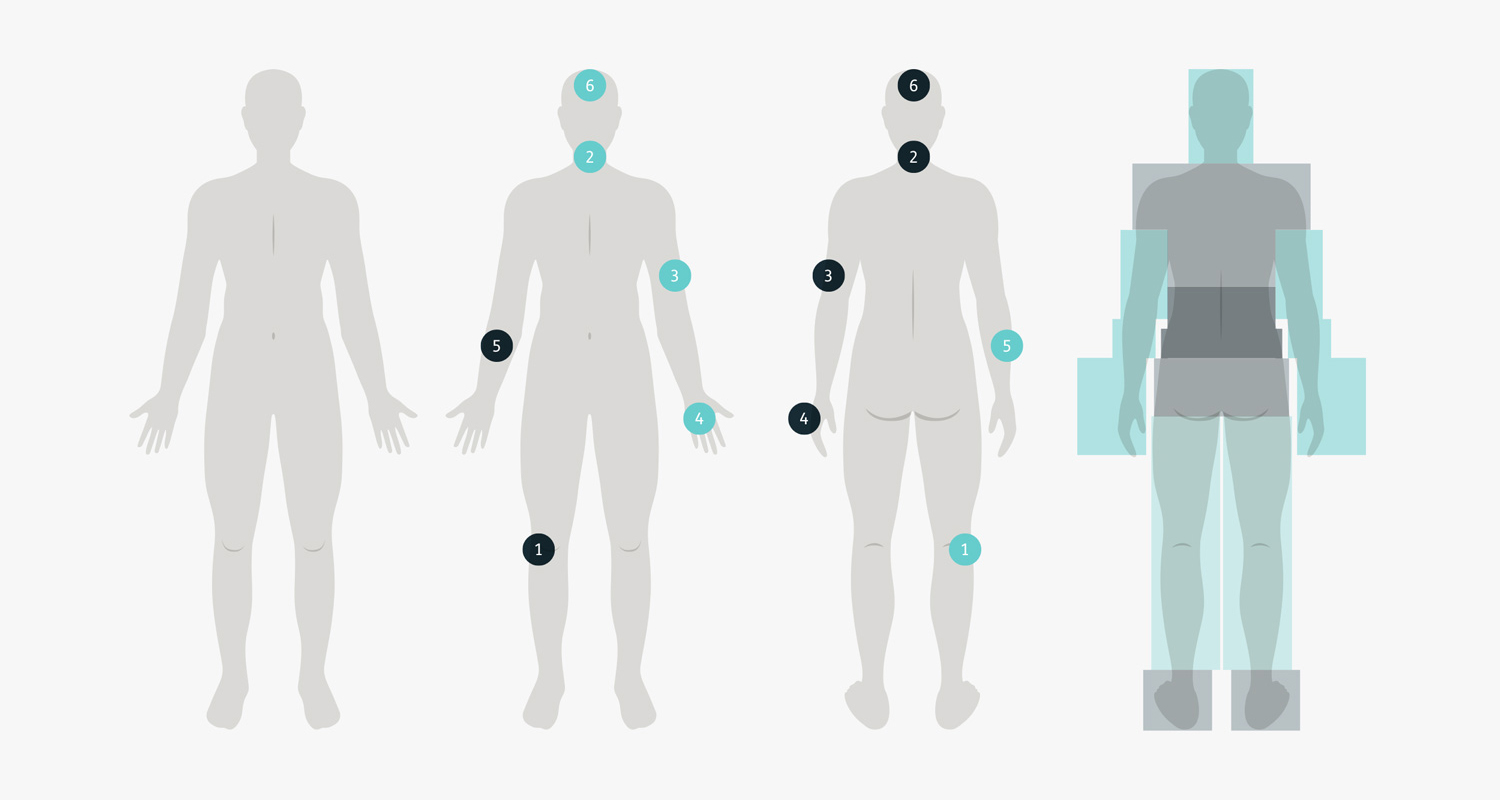
A big difference between the current web version of body maps and the new Android release was the ability to directly touch the graphic figure to generate a new record. Attention was given the creating an interface design that was large enough to have touchable areas. As well as this, users had to easily identify which open records related to the front, and which were on the back of the body, and quickly navigate between the two.
Left: Body shape illustrations were sourced and then adapted, and detail features added, so front and back views could be more easy identifiable.
Centre x2: Additionally, current recordings of skin conditions were differentiated with colour, denoting either front or back. This was also echoed within the selection tabs and text labels for clarity.
Right: ‘Hidden’ touch areas were created to give users accurate and usable space to select the correct anatomical regions.
User feedback was developed into a UI aligned with our established design. I also added some new interactions and components, using the principles from Google’s Material Design Guidelines for our Android based audience. My prototype was also updated iteratively (using Sketch and Marvel) so it reflected the most up-to-date designs.
High fidelity prototype showing a user journey for recording a skin condition.
Following a lean and iterative approach, we elected to release this new feature in stages, focusing on delivering first what users would value most. This also took pressure off the dev team to build everything at once.
At each stage, we evaluated user feedback and various metrics to assess impact. This method proved useful in building just what the customer required, and in some cases adapting or even removing future planned functionality.
– large care group project co-ordinator
At the time of this write-up, early indicators suggested positive feedback for our version 1 release. Nurses can now complete and evaluate wound assessments when they are actually with the resident, instead of when they return to their office. And there have already been requests for additional functionality that will further enhance the Body Map.
Further release versions are planned that will give carers the ability to record new skin conditions, but prevent them from specifying a course of treatment, as this requires a trained nurse – along with an improved method of adding photos. And usability issues identified within the web portal version, which were improved for the mobile designs, are now planned to be refactored into the web platform.