


Brand + Product + UI + UX
Dorset County Council (DCC) was concerned about the growing problem of social isolation experienced by many of its older and vulnerable population. In a joint venture with Appello (a leading provider of Technology Enabled Care Services), they envisaged a secure online social platform under the working title Community Channel South West – a £1m scheme backed by InnovateUK. Nourish was approached to architect, design and build an MVP to test user engagement level for a later commercial application.
The brief
• Design for a mainly elderly user group
• Make it private, safe and secure
• Encourage social engagement from users
• Create a name and brand identity.
I was responsible for the user centred design aspects, as well as the naming strategy and branding in a later phase of the project (see end of this case study). I worked closely with both internal and client project managers, as well as a remote developer team. Work was carried out in staggered sprints over many months due to phased budget releases, and the availability of the core team and stakeholders.
The main driving force (from DCC) was to fill the void for local support groups between their regular meet ups. Many attendees of such groups had little or no social contact between these meetings. The Community Channel was envisaged as something that could provide vital contact and support between members when they weren’t among one another.
Statistics of older people in the UK
Sadly, the following facts exist for our elderly population. 6% leave the house once a week or less(1), 24% don't go out socially at least once a month(2), and loneliness increases the likelihood of mortality by 26%(3).
Sources: (1) GovUK, (2) DWP, (3) iotUK.
From our contacts at DCC and Appello, we had access to local support and sheltered housing groups. Some were already using online platforms to stay in touch with friends and family. They had generally positive attitudes towards the digital world so long as they felt safe and it remained private.
• “It’s a lifeline”
• “I get a kick out of it”
• “Someone is always there to chat to”.
A support group we visited had been testing Kik to keep in touch and provide 24/7 support, but a random message received from an unknown user had broken their confidence in the platform. Facebook was also not trusted, with many feeling it was also too complex to use. Many also didn’t like ‘friends of friends’ having access to them online; “I don’t know them – they don’t know me”.
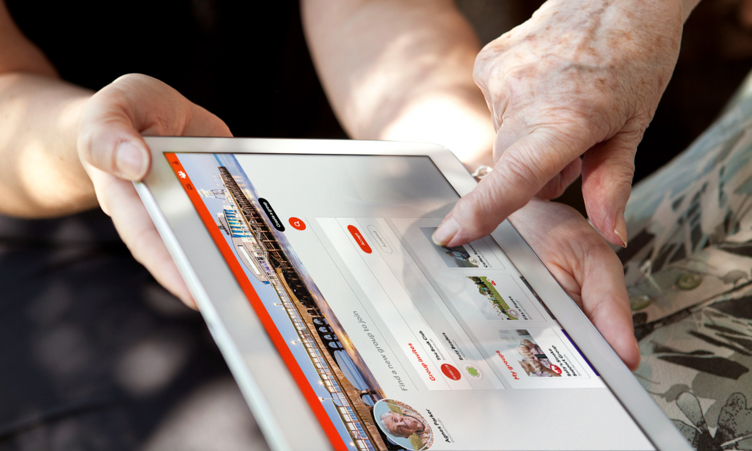
Private group structures
Based on user feedback, we decided to design the product architecture and user experience around secure groups – after all that's what they physically attended. Groups therefore would have their own timelines, and any posted information would not be visible to non-members.
Secure onboarding
In order to make the Community Channel a safe place, users had to be ‘authenticated’ in order to view any private activity within their chosen group. Members were onboarded by email via group administrators, who would normally be the organiser(s) of the physical meet-up groups. This meant users joined with people they already knew, and who were in positions of trust. It also meant that users with little or no experience of the digital world had someone to help and support them get started – in some cases this even meant creating email addresses with the users.
We tested the first prototype at a local Stroke Support Group (all women ranging from appox 60-80 years) who didn’t hold back with their comments! One particularly vocal participant raised several points, including challenging why the platform needed to know her postcode to create an account; “People will know who I am if they see my name and my postcode”.
Many participants were far more competent with the digital world than I had assumed. However they were on the whole still very wary of it – specifically ‘confusing language’, and too much information and options. All had concerns over their online privacy, and they used much smaller tablet screens than I had anticipated.
Key insights and learnings
• Security and privacy were paramount
• Use plain, friendly language
• The UI was too complex and confusing
• Require minimal personal details to sign up
• Chat and photo-sharing were 'must-haves'
• Design for lower-resolution screens.
As it was a group meeting, it had become dominated by one particularly opinionated participant. I made a note to try for one-to-one interviews next time, and write less condescending user messages!
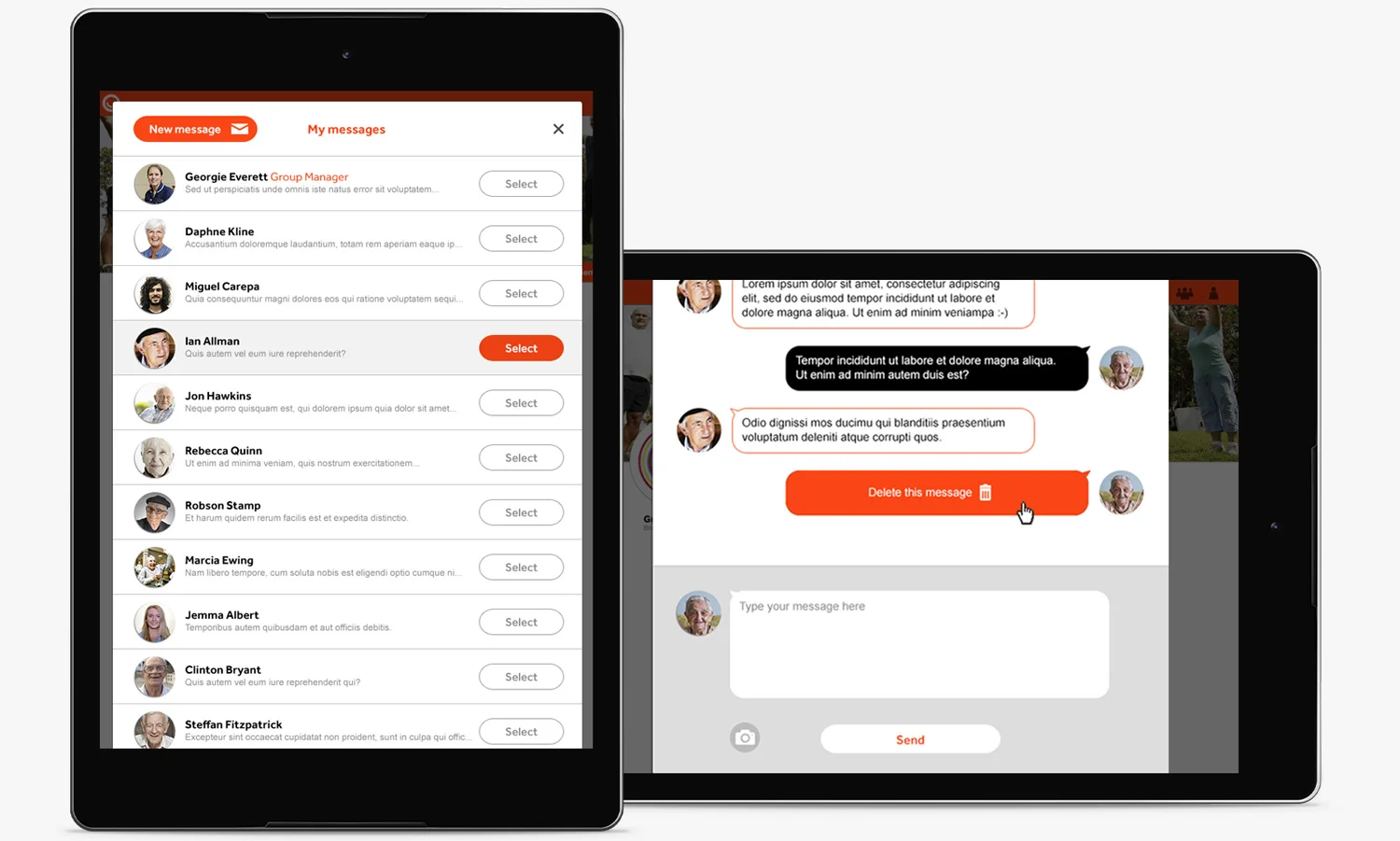
I simplified the UI layout, removing many of the distractions, and created a much easier way to post different types of content, such as text or photos. I’ve always liked the way Tumblr clearly differentiate the type of content for users to post, and thought this would work really well here for our typical users. We also added in new features, such as DM chat, a dedicated Groups page for users to manage multiple group membership, and a cleaner way to navigate across the platform.
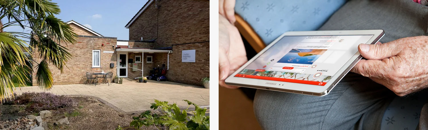
I visited a participating local Housing Association with the lead project manager from Appello. We found the residents had actually been using the first release version for a few weeks, so the usability test became a surprise feedback session. The onsite warden had been acting as the administrator for this community group, and also contributed to the feedback.
Key insights
• High adoption rate among residents
• The chat function was well liked and used
• Resident’s families had been added in as groups.
A board-level decision had been made for the existing Community Channel to have a strong relationship with the parent company as part of the planned renaming and branding initiative.
I made use of the Appello red, and their smile graphic within the new identity, and created a name that had a close sounding connection – Frello (friend + hello) which was derived from a client workshop investigating what the platform meant to users. The speech bubble smile allowed for the new marque to be used in small space applications, such as app icons, favicons, and within the product itself.
Due diligence checks were successfully completed, and Frello was formally registered.
Sequence showing the evolved association of the Frello branding with parent company Appello, and the final version below.
This was as far as my involvement with the project went. We received an emotive report back that following a successful pilot scheme with trial users, care professionals and commissioners, social engagement was seen to increase among users. Commercial and product integration opportunities were now to be explored for the platform.
Summary
While I was happy with many aspects of the project, there are some things I’d do differently now. Namely conduct one-to-one user research and usability sessions – to avoid disruption and participants influencing one another in group settings. And observe participants using prototypes and the product in preference to receiving strong opinions.