


Product + UI + UX
– Care Home Manager
Improve communication for carers starting their shift
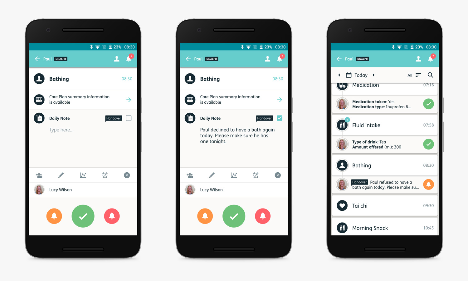
Briefing care staff coming on shift is crucial in maintaining the continuity, safety and empathy of each person they care for. Knowing they’ve taken their medication, had a restless night, drank enough water, been anxious, or enjoyed a visit from a loved one all contribute to the knowledge care teams require as soon as they start work. This is known as Handover. In many care homes this is a formal meeting, attended by all care staff, and recorded on paper. My job was to enable carers to record and review handover notes directly onto their Nourish handsets.
The challenge
• Allow easy recording of timely, accurate and detailed notes
• Reduce time required to create handover notes
• Make visible to the whole care team at all times
• Integrate efficiently into the existing product
• Implement for both web and mobile.
I led on the design, attending site visits and undertaking user interviews, building and testing prototypes, and delivering a finished user interface design. I also made follow-up visits to customers to validate the new release and observe it being used, as well as writing the customer facing updates log.
During the project, I worked with a number of users (care home managers and care staff) as well as relevant Nourish colleagues with recent and direct care industry experience. And of course I worked closely with the product manager and a team of web and Android developers throughout.
Customer feedback
We'd received multiple customer requests for an improved handover feature, through our customer support and sales teams. Many customers were using traditional paper notes in preference as there was too much navigation involved.
"We need to be able to easily add a note we're writing into the handover…”
Product testing
The previous feature had been implemented quickly, without enough design or user input. It was also only available on web, not mobile. I found it very disconnected and confusing to use. This was echoed by expert colleagues, who assisted me in understanding what our users would expect from a handover feature.
User interviews
We interviewed care home managers and carers, who all gave us real insights into the importance placed on handover notes – especially for compliance and care continuity. They told us our current product shortcomings, and described what they would like to have, and how they would expect to use it. All agreed they would like to give up using paper and start recording more detailed handover notes, quickly and easily.
Field observations
Along with my product manager, I attended several handover meetings across a variety of care environments. We observed common behaviours of senior staff hurriedly compiling end-of-shift handover notes on paper – sometimes from memory, sometimes from recorded notes on Nourish. One thing that struck us both was the fast pace of the verbal notes being read out, and in some cases the lack of meaningful detail.
Next we defined user stories based on all the research findings and complied them into a list of priorities. I then used these stories to define the user functions within the new handover design. I presented a system flow diagram to the team – product, customer service, training and account management – showing how users might navigate, and how this would fit within the product architecture.
From this, many ideas of how current and planned product features could ‘plug-into’ handovers were explored. A workshop session with the product team helped determine which features we were most confident would deliver most benefit to customers first – and a plan of release versions (1-4) was agreed.
Integrating new user task flows within existing architecture.
Early designs and journeys were validated with expert colleagues using paper and interactive prototypes. They were then refined for later stage hi-fidelity designs with real users.
One of the biggest discoveries made resulted in deleting a whole journey sequence. We'd assumed managers or senior carers would want to sort or edit handover notes as they'd previously been the ones making the notes – but most were just relieved this wasn't going to be solely their task anymore. They also quickly worked out they could access any saved note on whatever device they happened to be using, and so could intervene if necessary. This change saved a lot of valuable time for the dev team.
Further user tests with a hi-fidelity prototype confirmed that the new feature was both understood, useful and navigable – with one manager wanting to use it immediately! From here I moved onto producing the final artwork, working in parallel with the dev team, so we all understood where and how the new user flows and screens sat within the current architecture.
User adds handover note by ticking the checkbox within their routine user flow. A confirmation flag then indicates this within the timeline.
I attended two handover meetings and observed each care team using the new in-app handovers in place of the traditional paper forms they'd been using for years. The result was quite amazing for me to watch – not a single hiccup! No pauses in communication, no difficulty in using or navigating the new feature – in fact it was just as fluid as a handover meeting back at the start of the research phase. Many carers commented that it was great to have all the up-to-date handover notes ‘in their pocket’ – no more going to a centrally stored paper file, or interrupting their senior colleagues. Everyone could now have access to handover notes wherever and whenever they needed.
– care group IT & Marketing Lead
Next steps
As an Agile team, this was always a first release version, with plenty of assumed improvements for future updates. Tempting as it was to build a fuller version, it was also pragmatic to release early and validate through customer feedback. After a well-received launch, where adoption and regular use metrics were very good indeed, we started receiving many suggestions through customer support for additions and improvements to Handovers – many of which we’d already planned, and some that we needed to consider further.
All in all, it was a very positive response from users, and many of their suggestions proved that the new feature was of high value to them. A great result for the whole team and a solid foundation to build on.
Carers using the new handovers feature on their Nourish handsets for the very first time after years of using paper.